


Context
Everyone was downloading it. I couldn't get past day one.
When working at Growth·Design, I proposed we investigate Letterboxd.
The app lets you track the films you've recently watched—
And that simple UI had become the canvas for a wave of viral social posts.
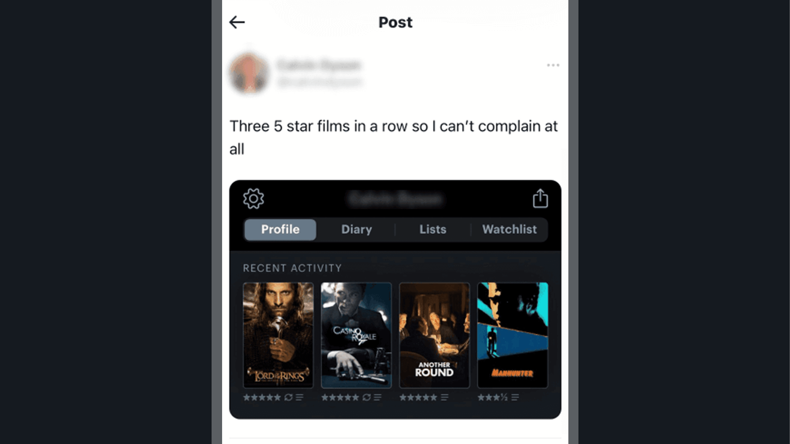
Those posts create a FOMO effect: viewers (myself included) immediately want to download the app, join the crowd, and share a post of their own.
Despite this, I'd tried the app several times before. Each time, I barely made it past day one.
When I spoke to other film lovers (exactly the audience this app should be a perfect fit for)…
I kept hearing the same thing:
I never quite got the hang of it. It was so confusing.
How could an app this well known, this viral, be this hard to keep using? That friction was worth investigating…
Walkthrough
A five-star app loses you in its first five minutes.
On the App Store, I was impressed. A promising value proposition and a great rating.

But the moment I downloaded it, I could see what was getting in the way of the experience that promise deserved. Three problems stood out:

It opens with a wall, then a pop-up. After a six-panel, unskippable intro carousel, you're hit with a pop-up. (A rough way to start a new relationship). Just like walking into a store or a restaurant, the welcome sets the tone for everything after it.
It floods you with decisions before you've built a mental model. The app immediately drops you into an endless list of films and asks you to choose between four new options that aren't distinctly different from one another.


Nothing tells you your choices mattered. With no clear exit, I had to force-close the endless flow, and got dropped onto a homepage with nothing to show where the films I'd marked had gone, or whether they'd saved at all.
All that effort, paid back with no reward, kills momentum and drains motivation. And it all happens before I've even explored what the app actually does.
But it gets worse. If you somehow still have the motivation to explore, you're met with a pile of new concepts.
I finally managed to add a film, and got a toast message telling me it had gone to my diary. What diary? I'd never seen one, and had no idea how to find it.

A great starting point for any app is Familiar Nomenclature (using words that fit the mental model your user already has).
Here, Letterboxd layers Diary and Journal on top of a Watchlist it had already introduced—
And none of them were the thing I was actually looking for.
I was left unfocused and unclear.
But every one of these was a design choice, and a choice can be remade…
Solution
First, make the welcome worth the effort it asks for.
The instinct to add a quick preference selector was a good one.
A stripped-down flow can be a great activation piece. You get the user to start populating the app with their own data, which chips away at the cold-start problem every new app faces.
But they missed the chance to make it fun.
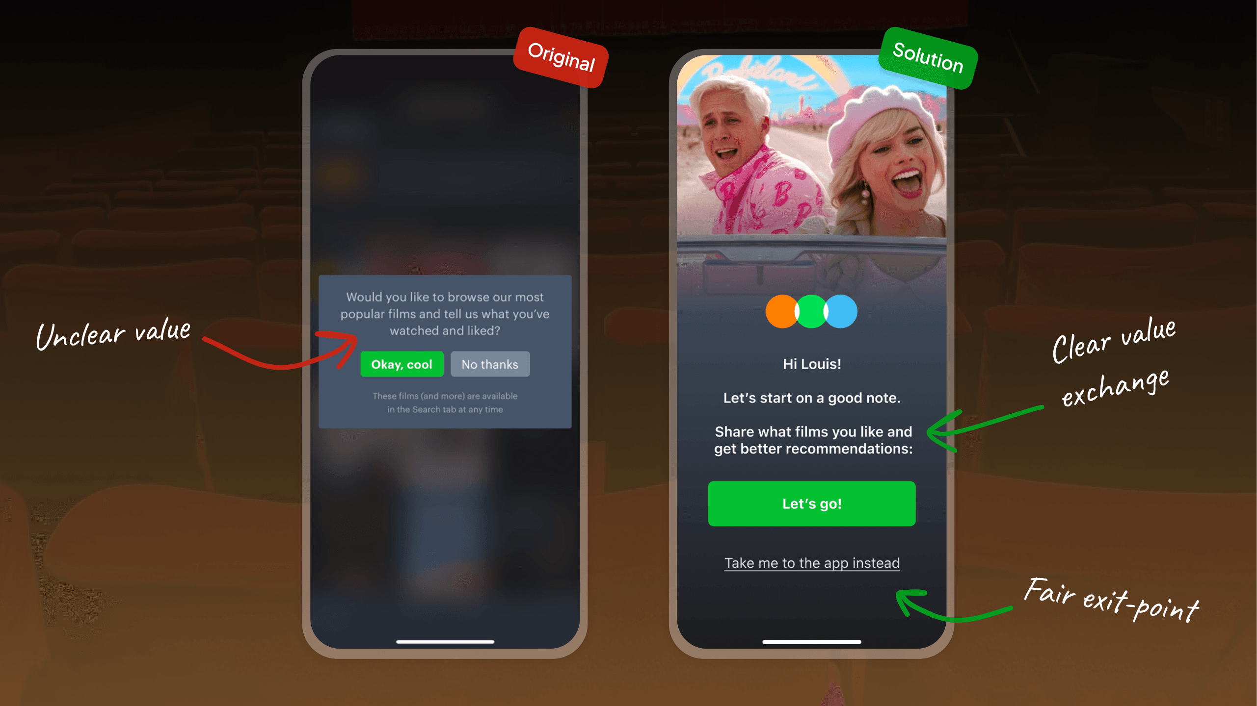
Reframing the pop-up: Keeping a first-screen prompt made sense, so my trade-off was to improve it rather than kill it—
To move away from the lazy pop-up pattern and build a screen that creates a little positive emotion before asking new users to invest effort.
That showed up in the visual design as much as the copy.
Instead of the original pop-up's murky value exchange, I asked users to share the films they like in exchange for recommendations (exactly what you'd expect a film database to be able to give you!)
I also gave them an easy, non-judgemental way out. The visual hierarchy was already doing the nudging, so there was no need to guilt them on top of it.
Fixing the Tinder-style preference flow: The original had three problems: too many choices, no feedback on what those choices did, and no clear exit.

So I solved these by, first, making it obvious what you'd get for finishing, and what the end goal was…

…And also by leaning into the fact that it already looked like Tinder, and by cutting the interaction down to Tinder's exact two choices: swipe left or right.

But a better front door only matters if there's a clear reason to walk through it.
And that's where the real problem was hiding…
Problem
Five minutes in, the app had broken both its promises.
Take yourself back to the hooks that made you download the app in the first place:
The social posts of people sharing their most-watched films.
The App Store promise itself: "The social network for film lovers."
Now fast-forward five minutes into the app. You've seen a tonne of features, and yet not one of them has delivered on either hook.
It looks like they had too many ideas and never capitalised on—
UX insight
Jobs To Be Done
A Job-to-Be-Done reframes a product around what someone is trying to accomplish, not the features you can ship them. Figure out what job a user is hiring your app to do in a given moment, and you suddenly know which features earn their place (and which are just noise).
Letterboxd's users had hired it for two jobs: track the films I watch, and talk about them.
Everything after this came down to a single screen, and the app was already getting that screen wrong…
Solution
The homescreen is the first place a user looks to work out what an app is for.
Give them too many features, and you dilute the one answer the app is allowed to own.
That was the problem with Letterboxd's homescreen:

It showed tabs for Films, Reviews, Lists, and Journal — ignoring that I'd just been told to look for a Diary.
It stacked more unlabelled icons in the bottom bar—
And it filled the page with film posters under the heading "Popular this week."
But nowhere did it show the social side of the app (beyond the word popular), and nowhere could I track the films I'd just added.
Those were the exact open loops I'd been hooked in on, and let's not forget I'd just finished an onboarding flow rating and adding films.
Where had any of it gone?
So I proposed reducing the interface's complexity strategically:

Eight new tabs became two: My Films and Activity.
The My Films tab immediately addresses both jobs at once:
How to recreate the social posts you'd seen—
And what your onboarding choices actually did (recommendations based on your preferences).
Now there's one clear place to track the last film you watched, which lets Letterboxd own that role whenever its natural trigger fires: the moment you finish a film…

And once the app is populated with what you've recently watched, recreating those viral posts becomes effortless. Add a share button and Letterboxd can encourage far more of them:

After all, another big missed opportunity lives not just in owning the role of solving for a particular job, but for Letterboxd, it also lives in not nudging and encouraging more of the organic marketing content that customers were already producing.
The app's one remaining tab, Activity, helps users discover the existing Letterboxd community: populated with fresh, valuable content every day.

Two tabs. Two jobs.
One clear answer to what is this app for?
And that answer is the difference between an app you download and forget, and one you keep opening.
Learnings
Virality Gets You Downloads.
Focus Gets You Product-Market Fit.
Virality earns the install. The job earns the retention. Those viral posts created real FOMO and drove downloads. But the app never delivered on the two jobs they implicitly promised. It didn't help you track what you watched, and it didn't help you talk about it. A hook that isn't matched by fulfilment just turns curiosity into churn. PMF isn't proven by how many people show up. It's proven by whether you complete the job they showed up to do.
Never charge effort before you've paid out value. The onboarding front-loaded decisions. An unskippable carousel, an endless film list, four near-identical options. All of it came with no feedback, no reward, and no exit. Effort without a visible payoff drains motivation before the user has even built a mental model of the app. Earn the right to ask for input by first showing what they get back for it.
You can't own mindshare with eight tabs. The homescreen is where users decide what an app is for, and every extra feature dilutes that answer. Cutting eight tabs down to two ("My Films" and "Activity") let the app own a single, triggerable role. It became the place you open the moment you finish a film. Focus isn't a constraint on the product. It's what lets the product occupy a clear space in someone's head.

Growth·Design
"Most designers focus on trends. Justin's approach starts from psychology, from how people actually think. That matters more every year, as AI commoditises interfaces and code. Any product team hiring a designer would be lucky to get him."

Dan Benoni
Co-Founder, Growth·Design