


Context
Nine in ten first-time customers didn't order again
UK marketplace Not On The High Street had a retention problem.
Despite being positioned as the best UK marketplace for small, independent businesses selling unique products that make the perfect gift—
People just weren't coming back…
Share of customers who ordered again a year after their 1st purchase
Web customers
App customers
And whilst my strategic proposal looked to have people interact with NOTHS between the big gifting moments—
I recognised that unless we fixed the fundamentals, and created a smooth, delightful journey for first-time customers, they wouldn't come back regardless.
There are two psychological principles that helped me to prioritise this…
Insight
We don't remember a whole journey, we remember moments
Two findings told me why the seams were costing us customers…
The first is from Daniel Kahneman and Barbara Fredrickson—
Who found that humans don't judge an experience by its average, or by the sum of all its micro-experiences.
Instead, our brain heavily weighs the peaks (high or low) and the end.
This is known formally as:
Behavioural insight
Peak-End Rule
People judge an experience by its peak and how it ends.
Peaks, when pleasant, often correspond to memorable delighters.
So when buying a gift, the peaks should ideally come from:
Finding the perfect gift idea
Discovering you can make it even more perfect (personalisation, gift wrapping, adding a card)
It arriving on time
Giving it to your loved one
Receiving a thank you from your loved one…
And 'good design' would let you feel all of these seamlessly, with no interruption...
The second insight was:
Behavioural insight
Cognitive Load Theory
The total amount of mental effort that is required to complete a task.
Discovered by John Sweller, who showed that every bit of attention spent working out how something works is attention taken from the task itself…
You can think of cognitive load as the processing power a person needs to interact with a product and all its stages…
Exceed what they have, and they notice the design.
This is evidenced by all those moments when you push a door that turns out to pull.
The handle on the push door killed your momentum, and made you notice what you wouldn't have if it had been a flat plane instead.
And our marketplace's lack of consistency introduced too much cognitive load for the journey to be seamless, let alone deliver great peaks…
Instead we created negative peaks: confusion, uncertainty, and worst of all, errors that showed up on the final gift.

Attention that should have gone on the gift went on the interface instead…
…And we could see it in our customer support tickets. (I suspect it was louder in all the customers who simply never came back).
So before we built anything new, I walked the journey end to end…
Experience Audit
What a journey audit and customer service tickets revealed
Keeping the gifting 'job' top of mind, I walked through the whole customer journey to identify some key problem areas.
This was something I did with Product Lead, Lorin Minxhozi.
Alongside this audit, I also sat with customer service manager, Natasha Valentino, to understand the biggest sticking points for customers captured in service tickets:
Delivery information wasn't glance-able, and the controls didn't have a feedback loop
Considering that getting something in time for a specific date is quite crucial to the gifting experience, it surprised me to find that on the product listings page (PLP), the product cards displayed no information about delivery—
Leaving customers to have to go into each product in order to discover its delivery date.

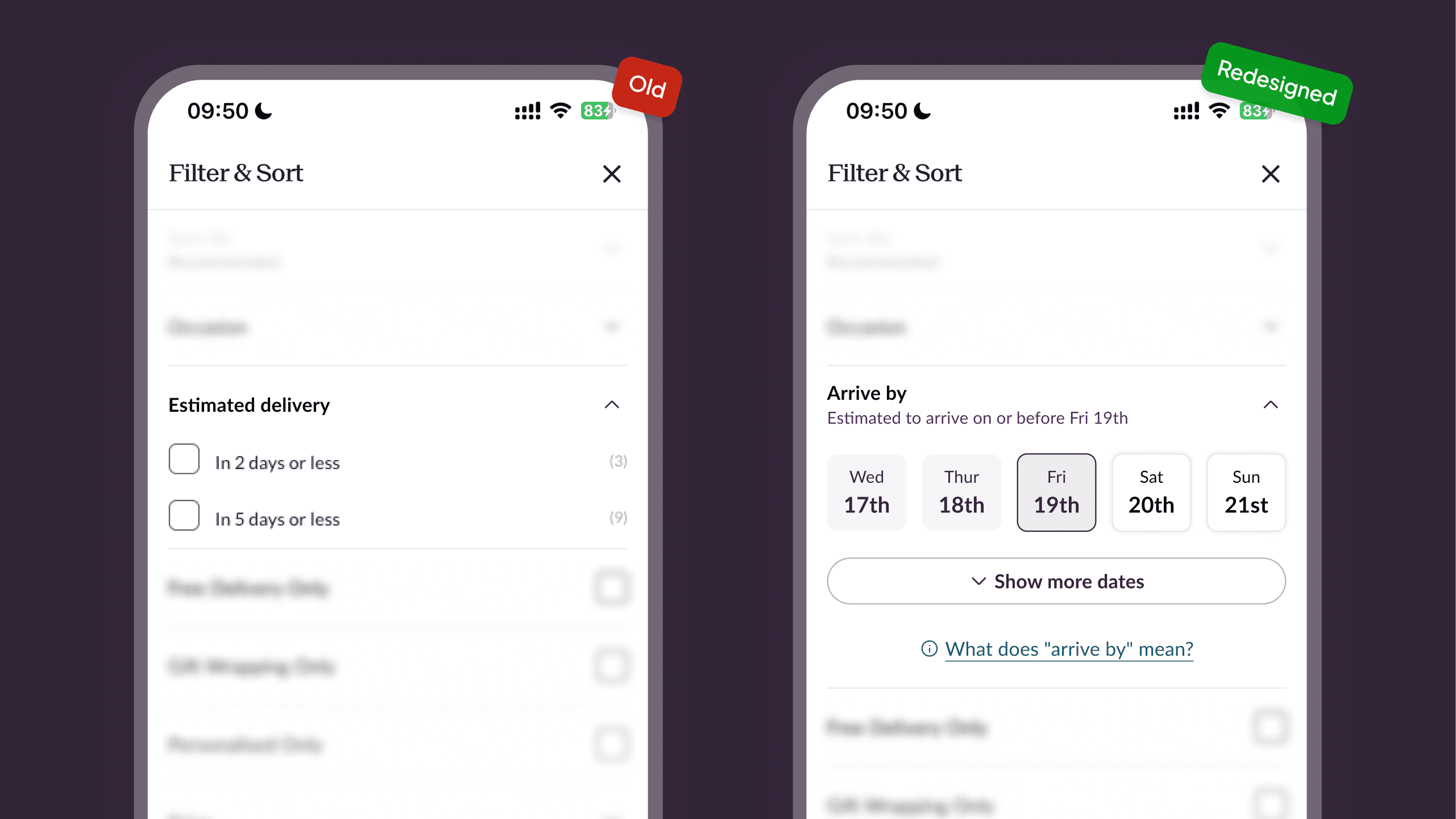
That said, there were filter controls for delivery, but the wording of them didn't quite address the customer's specific requirement, and the range would also still leave them to have to infer which products arrive by which date.
And on the product details pages themselves, the delivery information was displayed in a delivery method first respect (e.g. Standard Delivery, Express Delivery,
Saturday Guaranteed)…

Which is more a reflection of the means to achieve the job, rather than the glance-able information the customer wants:
When will this arrive?
And how much extra will it cost me?
Personalisations weren't fun and caused mistakes
One of Not On The High Street's key value propositions is the number of products that are available for customers to personalise (add a name, photo, choose specific details of the product).
Despite this, the way it was presented directly on the product details page itself made adding a product to the basket seem effortful and long, and—
Because the Add to Basket button was still visible, users who clicked on it before they completed the personalisation options were punished with red error states for incomplete fields.

When explaining the severity of this to others in the company who had gotten used to this, seemingly logical pattern, I likened the experience to that of being in a physical store, finding a pair of shoes you like, being asked by a sales assistant if you're ready to buy them, to which you say you are, so they say 'follow me' and walking you up to the purchase counter…
…Only to be shouted at by the assistant for not having specified your shoe size, colour, and if you wanted an engraving before coming to the counter.
Digital experiences, re-explained via metaphor as a physical experience, usually works to shake people out of apathy.
There was also a lack of a review step following the personalisation fields, which showed up in customer support tickets that reported mistakes in the final personalisation.
It was hard to understand why delivery costs were so high
Like a lot of things, it was easy, internally, to forget things that new customers wouldn't know about Not On The High Street.
One of the key things was about us being a marketplace, rather than a store.
The consequence of this was that customers sometimes reached out in confusion as to where half their order was…
Only for the rest to arrive on a separate day, because, as they hadn't realised, these were two different orders, delivered by two separate partners who sold on the site.

I kept this in mind as I went through the journey, and whilst there were a few different opportunities to make this clear, I realised the place people would both care and benefit from understanding we were a marketplace in was the basket page.
At the time, the basket page didn't do much to indicate the fact that products from multiple partners were going to be dispatched from those different partners. This also meant missing specific delivery date and cost information (again), which also made stacking delivery costs confusing.
Customers might see a high total delivery cost, and exit out of the experience - not realising that this was a result of the delivery costs across partners.

Of course, even if you could infer this, making the right call as to which product to remove from your basket to reduce your total delivery cost was made near impossible since the cost breakdown was unavailable on this page.
Gifts often arrived at the 'wrong' address
For existing customers with multiple addresses, there was an issue that kept coming up where they were finding their order arriving at the wrong order. The final invoice in these disputes often showed a customer actually selected the address it arrived to, which indicated that the validation process was not made clear.

The order confirmation wasn't leaving people on a high
Lastly, the purchase experience end comes for the gift-er with an order confirmation screen.
Firstly, the screen features a photo upload button. This is for products that feature a photo personalisation option, to allow the customer to upload their photo and have it as part of their gifted product.
The question you might immediately have is, why does this not exist within the purchase experience, rather than after it.
Turns out, the answer to this lay in a past initiative to improve conversion. The idea being that by delaying the highest required effort for users, you'd get them more easily through to checkout and beyond.
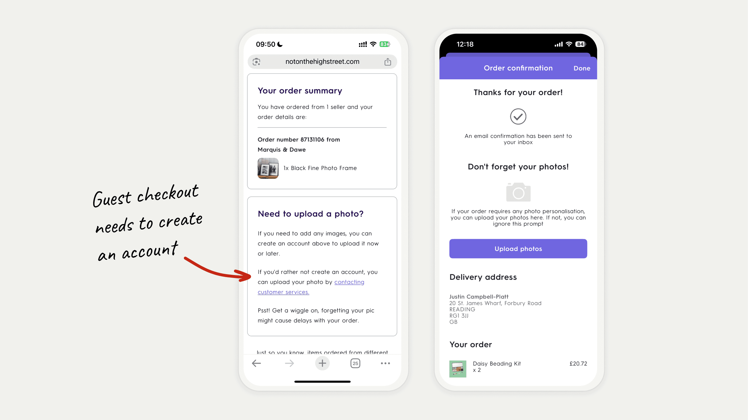
The problem was the aftermath of issues it created. Firstly a number of customers simply ignored this section and forgot to add their photos to their order - which delayed their order, and required the seller to have to reach out to the customer to chase it.
Worst still, this post-checkout photo upload also appeared on every order confirmation page, regardless of whether the product had a photo upload option or not, leaving some customers strangely adding a photo to an order that didn't have the option available (confusing sellers)…
…And, for products that did feature photo upload, but required customers to pay for it as an add-on earlier in the purchase flow but didn't - if a customer then uploaded a photo, seeing the option to do so on the post-order screen…

This again would delay orders as sellers would have to chase customers to determine if they actually wanted the photo personalisation after all, and would then require additional payment after the original order.
Either way, this screen both functionally, and visually, did little to create a peak at the end of a such a seemingly meaningful purchase journey.
Solution
Small improvements for a big experience uplift
Over the course of months, amidst other projects and business priorities, I was able to implement the following changes which touched the customer experience end-to-end:
Making delivery information glance-able, and giving customers better controls
The filters were redesigned to let customers explicitly pick an 'arrive by' date.
We iterated on this to also show the previous dates leading up to it visually highlighted.
We did this because a delivery service limitation we faced was that we could not fulfil orders for a specific, nominated date.
And this interaction (whilst great for capturing customers main job) might also give the impression that we could fulfil a date-specific delivery. The wording 'Estimated to arrive on or before [Date]' would also show on customer input.
The product cards component (as featured on the listing pages) separately were getting a revamp, so I ensured that the key delivery signals were all present and glanceable on each card.
Since the space was limited, there were many iterations which resulted in a version which simply showed the delivery date and cost for the cheapest delivery method (as to prioritise showing free delivery on as many products as possible) - unless the customer selected a delivery based filter - where the associate rule would override the default.

The delivery information on the product details page (PDP) was also made to be more prominent…
But more importantly, more glance-able—
Which meant reducing the amount of information to the date of estimated arrival for the cheapest delivery option, as well as the fastest.
Just by having these two separated by a clear visual hierarchy, customers could quickly determine if the product was going to manage to fit their urgent gifting need.

We hid personalisations until users were ready to explore and reduced mistakes made during the flow
We took the personalisation fields that previously sat on-page, and moved them behind the main page call-to-action button.
This meant showing the options in a drawer on desktop web, and on a full-screen sheet on mobile web.

Because of the specific nature of the personalisations, we also had to duplicate the main product photo carousel to show in the drawer/sheet as well as the main page…
After all, customers would often want to look at the photos again to see where their personalisations would go. (Sellers would sometimes also put a colour key or font key in the photo carousel for reference which also needed to be accessible).
This meant that customers were not punished with error states when clicking on the main product page CTA.
We also introduced a personalisation review step that followed the entry step, just to do what we could to encourage customers check what they've added as a way to prevent mistakes.

Lastly, we finally moved photo upload into the personalisation.
Which meant adding a custom new input component which transformed to allow for rearranging and deleting of specific photos once a user had uploaded more than one photo.

Updating the basket to educate customers about marketplace-dynamics and delivery implications
Making customers more aware of the fact that we are a marketplace has many benefits:
Help to understand they are buying from (and therefore supporting) small, independent businesses - each with a story behind them.
Facilitating customers' curiosity to discover a larger variety among the product range
Setting expectations about varying quality of products
But where it mattered most to orders being made is that it would be that it would help customers understand that orders including products from different sellers would mean separate deliveries—
Meaning different arrival dates, and separate delivery costs.
So to meet people with where this information was most crucial, I redesigned the basket to show products and orders more visually separated into what we ended up calling 'partner cards' and breaking down the specific delivery costs and estimated arrival dates associated with each partner order.

I also added a banner to speak to frame the education of separate delivery costs as part of the handcrafted and hand-shipped nature buying from small businesses.

Adding validation to address selection and each new added address
To minimise wrong addresses being selected, I ensured the new checkout featured a more intentional process for both selecting and adding their delivery address.
This meant no-preselected delivery address at checkout, requiring user input — the sort of friction I was willing to add to the flow to reduce the number of customer mistakes.
And in addition, as part of this work, I requested we add a dedicated field to each saved address to include the recipient's name - to make it easier in the future for customers to quickly scan through their varying addresses.

Order confirmation reinforced the magic of shopping with Not On The
High Street
Lastly, the order confirmation was redesign to create a new, more rewarding end of the purchase journey for gifters.
Adding the hero image of a handful of sellers not only reminds customers of the fact that we're a marketplace, but rewards them with the reinforcement that they're supporting small businesses, which means supporting people's lives.

A touch of human empathy is always rewarding.
Beyond this, I simply made it so that estimated delivery dates are quickly highlighted as to leave customers clear on when they can expect to receive their order.

Bonus: Adding an upsell that aligns with the gifting experience
There had always been a desire in the business to try to increase the average customer order value with upsells.
Most commonly, the business encouraged it to be in the checkout as a sheet: not unlike the way Ocado or other food delivery apps forced users to scroll through a sheet of products before completing checkout.
But the idea as to where to place such an upsell felt too invasive and conflicted with our value as the place to buy a considered, meaningful gift.
This is where Product Lead, Lorin Minxhozi and I noticed that there was an opportunity to take the customer intention that 'add a gift receipt' captured (I intend to make this purchase a gift) and move it into a dedicated sheet in the basket that could be triggered by the button 'Make this a gift' that lived under each product listed.

Then we'd show optional extras that related to the experience of gift giving:
Gift wrapping (previously non-standardised and in some personalisation fields)
Gift receipt (previously in checkout)
Add a card (previously found by searching for, or navigating to card category pages)
Add a gifting extra (a new carousel of products with relatively small cost)
And in terms of selection criteria: each card and product also needed to meet the same delivery date that the product it was attached to.
The Impact
Small bridges, that made for a smooth ride
3 months later, and I was able to check in with Customer Service Manager, Natasha Valentino, whom revealed that the impact of the changes to the purchase experience was greatly felt in the support department.
When compared to the previous August, the month of August featured an:
in post-order customer support tickets
As for the impact on retention, whilst the results still await, we had already seen an impact thanks to the gifting upsell integration:
in average customer order value (from £33 to £36)
Learnings
Some friction is good friction.
A conversion win can be a cost passed to someone else. Deferring photo upload until after checkout lifted the metric that team was watching. The work reappeared as chase emails from sellers, delayed orders, and tickets landing on a different department's dashboard. Follow the effort after it leaves your screen. It lands somewhere.
Put friction where mistakes are permanent. An engraved name and a delivery address have one thing in common. Once the order leaves, neither can be fixed, so both earned a deliberate check.
Only attach commercial asks to an intention the customer already has.The business wanted an upsell sheet in checkout. Gift receipts told us the exact moment a shopper decided the purchase was a gift, so we built the sheet on that moment in the basket. Order value moved because the extras belonged to gifting.

"Justin gets really engaged with all parts of business - trying to understand every challenge and constraint, and builds strong relationships with the likes of marketing and commercial in the process."

Lorin Minxhozi
Product Lead, NOTHS